Been There, Patient Care Advocacy
- Project: Logo Design
- Date: Spring 2024
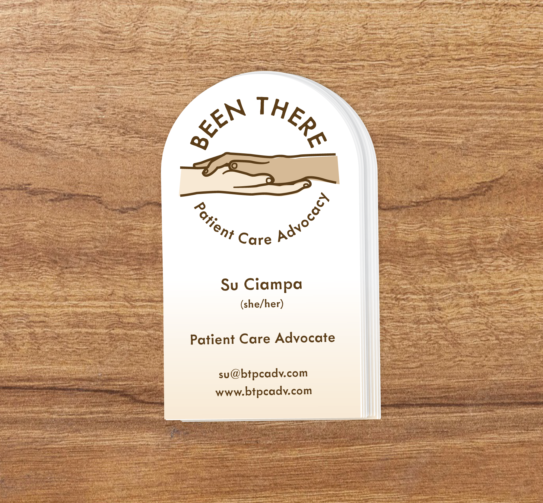
I recently completed a logo for a Healthcare startup, Been There, Patient Care Advocacy. The goal was to develop a personal theme that would resonate with, and gain the trust of patients facing a rocky road of diagnosis, prognosis, and or recovery. To reach the goal hand-drawn style fonts were selected to accompany symbolism of hands in a position representing support and care, then finalized in a soft, skin-toned color palette.
I was referred to Mike by one of his clients while I was still trying to figure out how to articulate what my business is and how to convey warmth and invitation with my logo. Mike dove deep with me on the whats, hows and whys of my business and drafted four potential logos, asked for and actively listened to my feedback, then made a few small adjustments that got it just right. The whole process was transparent from budget to turn around time and final product and Mike is the kind of professional you want to work with--he will take great care of you!